Last week I was a part of an exhibition showing themed on Weightlessness. It was a free interpretation, impromptu event. I went through a series of possibilities and ended up going with an idea centered around silver lining. As an optimistic term, silver lining means that you recognize the past and present, the good, bad, lovely and the ugly. Aside from all the shit that may be going on, it’s important to remember that there is (hopefully) silver lining somewhere in the bigger picture – even if that means waiting to realize it. Finding that is bliss and hence, reminded me of the feeling of weightlessness. A moment where time kind of stops and at the same time seems to be going at warp speed. So, I have a thing for collecting little things that serve as a sort of memory to a specific moment or time in my life experience. They gave a similar purpose to photographs, letting the mind escape back to a moment in time. I decided to gather up some of this stuff and fix them together as a way of showing a sort of visual narrative, a window to past memories and experiences. The superficial features of the piece were swept away in silver and given a visual clean slate. I haven’t gotten images back yet but I will be posting them soon.
So right now I’m working on a couple of collaborative projects. One is design based and the other is mixed-media / photo. My friend drew is the current design compadre for developing a pitch for our class’ senior exhibition show poster. Four things: copy machine, eyeballs, a bit of cheer, and nice typography. My roommate and I are doing the photo-based project while exploring our shared obsession with patterns, texture and fabric. We went to a fabric store the other day then decided to disperse and grab whatever fabric we were drawn to. Afterwards we met back at the cashier and saw amazing similarities between each one- though, mine had a “jess feel” and her’s had a “lil feel”. I love getting the opportunity to make work that gradually develops as a product of multiple brains working together. Even better, I’ve been in undergrad with these kids since Day 1, and as this chapter of life is coming to an end, every day is presh. Each of my compadres and I have overlapping styles, but bring subtle differences to the table. Working in groups can be tough sometimes, especially if you get wrapped up in your idea being the best solution. It’s important to go with the flow without letting ideas that you really care about get left unsaid or out at least consideration. I look forward to seeing what we come up with as things come to an end. Keep those eyes peeled for some visual updates.
50 album covers. 50 days. 50 typefaces.
probably one of the projects I was most fond of last semester. Listen to a different album and design a cover only using type by the time its over. 5 a week for 10 weeks. This is the package I made at the end using a template from a borrowed book. I’ll post a shot of the top view on a later date, the file has disappeared.


this is a hypothetical site I just designed for the AIGA’s leadership retreat this summer called engage.
this isn’t at all what the site will actually be but for web media 2 we used the event as a platform for practice in designing for 1 page websites.


The first poster was to be based on a childhood memory mapped out with found and photocopied typographic elements. This particular memory map was conceptualized around one of my most cherished items on the playground, the swings. The feeling of flight and freedom while soaring into the air always made me happy and this map remembers specifically the school I attended for 9 years had trees lined behind a fence parallel to the swings. Everyone would see if they could swing high enough to touch the leaves towering over with their toes. The lower case ‘a’s in this typeface reminded me of the organic leaf structures that was the target of interest during the activity. The periods are placed in a moving repetition that makes one think of the chains of a swing that sway back and forth. They are arranged in a way to give the viewer the same since of light and carefree movement through the air that I remember.
This psychogeographic map was to be set up describing a personal Drift while we learned about situationism and Derive. The basic concept was to do so was putting oneself in an untypical situation from the daily routine, getting of the beaten path, and experimenting with places beyond your comfort zone while limiting the terrain to the city of Chattanooga, TN. This map is in response to my visiting and observing several different coffee shops in the downtown area. I have recently and unintentionaly integrated going to Starbucks into my daily routine. It’s easy, convenient and they know my drink. It became all too comforting and addicting. This sparked my mapping concept and it became about branching out, trying out other coffee shops which I had never noticed or some even heard of, despite being located in such a close proximity of where I spend most of my time. I recorded my observations and experiences on plain white paper coffee cups, one for each place visited. Certain portions of scanned in distortions are taken from each cup because each coffee shop seemingly had its own unique personality, array of customers, and all I could do was take in how distracting it seemed. These sections are pieced together and begin to form a solitary structure building the relationship to my ending thought that all of them still share many key things in common. This form is presented on a circular poster painted with coffee to subtly reintroduce where the mapping began on a cylindrical cup of coffee.
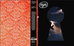
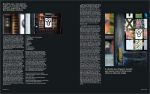
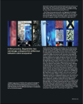
The outline for this project was based around designing a cover, back, and article layout that was fitting to the personality of Eye Magazine, The International Review for graphic design. The featured article to be used to set the imagery and unique details to this particular layout was States of Wonder by Nancy Spector. The layout as a whole is designed with variations based upon the same grid visually playing with simplistic arrangements and compositionally sound forms of negative space. I chose to photograph unique images of Sagmeister’s work, the main featured designer within the article, rather than using a straightforward editorial based style.
The Photographs used in the layout spreads are from Sagmeister’s book series, Things I have learned in my life so far. The smaller booklets within the laser cut case are placed outside onto various doors to give the audience a different perspective with the ways to view a piece of design while upholding the integrity of the work itself. The artists mentioned do not confine themselves to staying inside the gallery system and the particular placements play on this concept within the contents of the article. The cover of the magazine left to be more experimental. The keyhole with a portion of one of Sagmeister’s works builds a relationship with the inside concept of the doors while the back is simply a beautiful and engaging pattern suggestive to another article in this particular issue.


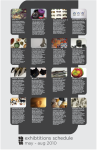
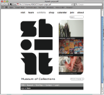
this a five-part series for a Museum of Collections exhibition. The name of the museum, logo, a unique collection to my personal belongings, a featured exhibition poster, an exhibitions schedule poster, a post card mailer, an e-blast, and a webpage were to all to be created and live together as a dynamic but close aesthetically knit family. My exhibition featured a collection of ticket stubs I have held onto from the past several years. The name Perforated came from that as the tickets all have perforation in common no matter where or when they came from. The front poster interacts with the name Perforated by the addition of a perforated line running across the word.